Creating a sustainable resources portal to support women

Partner

Background
Multicultural Centre for Women’s Health (MCWH) engaged Code for Australia to improve the user experience of their Health Educators Portal and scope a redesign of their website.
MCWH is a community-based, not-for-profit organisation led by, for, and with women from migrant and refugee backgrounds. It increases migrant and refugee women’s opportunities for health and well-being through bilingual health education, advocacy, and leadership.
Code for Australia’s model has been successful in helping not-for-profit organisations across Australia embrace innovative technologies, and because we are a social enterprise operating on a not-for-profit basis, we can provide high quality work and independent advice at a lower price point than other agencies.
To start our partnership, MCWH asked Code for Australia to
Ensure the Health Educators Portal is well-designed and usable
Ensure the Portal can be easily updated and maintained by MCWH staff
Scope a future website redevelopment
Help MCWH understand the users of both the Portal and website better.
Building a sustainable Health Educators Portal
The Health Educators Portal houses a wide range of health resources in various languages. It is accessed by health professionals supporting women and managed by MCWH staff.
MCWH had a range of important internal and external stakeholders for Code for Australia to interview about how they used the portal, current pain points, and how it could be improved.
Portal users said the system was already a simple tool that they trusted. However, our research identified several key requirements to improve the portal, including:
A search function with keywords and filtering options
Making it easier to see what was new, including visual indication on resources and an updates feed
A feedback function to flag resources that are out of date or no longer appropriate
Administrators of the system had their own feedback and needs for an improved portal, such as:
To be able to see patterns of resource use
To be able to categorise and present resources in multiple ways
An easier management experience
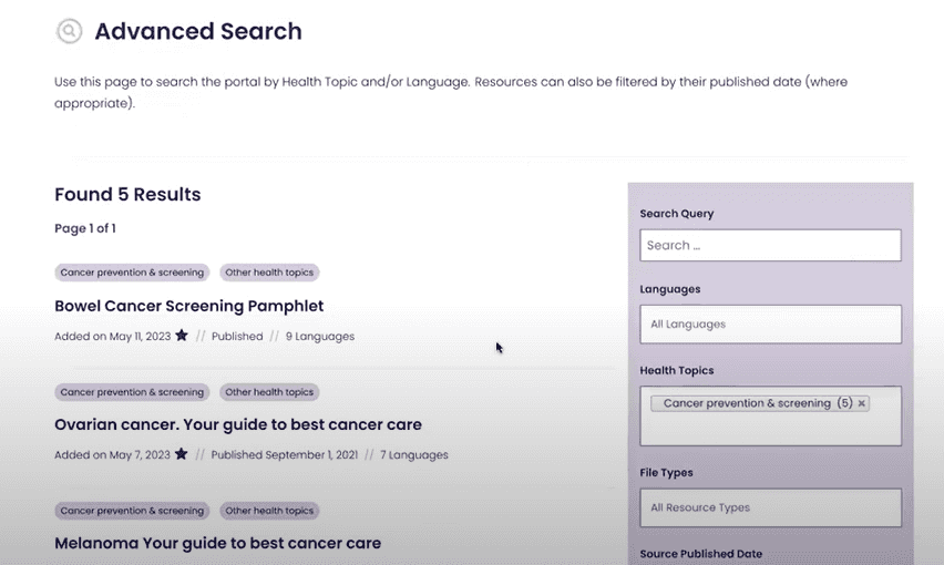
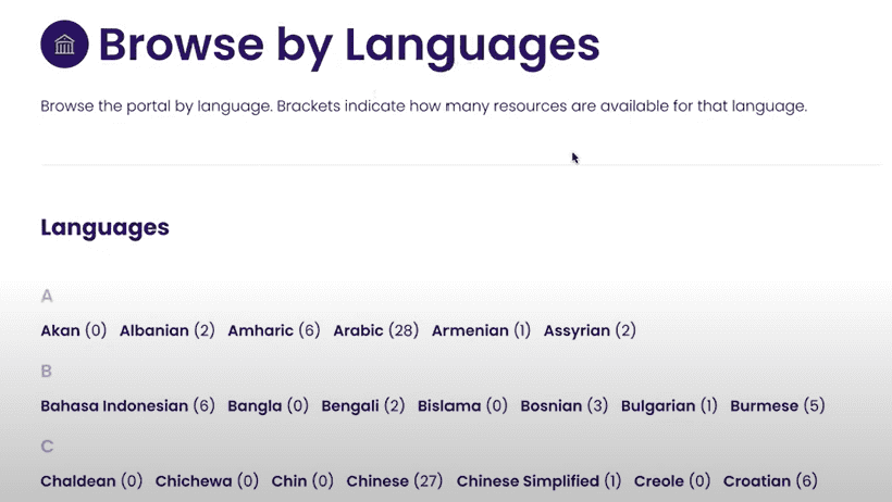
The result is a new portal that makes it easy to search and find new resources or resources you have previously utilised. The portal is more secure with account management and a secure login process. Usability testing has found the portal is easy to navigate and easy for staff to maintain.
Scoping a new website
Starting with user research underpins all Code for Australia work, so when our team started to scope the redesign of the website, they started with talking to website users first. .
Internal and external users identified that the current website was difficult to navigate, not all services could be easily seen, and contained out-of-date information.
Based on our research, Code for Australia has recommended that MCWH build a new WordPress site with improved content strategy, information architecture, and mobile view that MCWH staff are equipped to maintain.
We look forward to continuing our digital partnership with Multicultural Centre for Women’s Health.

